A website that makes people understand what you do in thirty seconds — and why it matters to them.
The problem is rarely the visual design.
Almost every business that approaches me for a company profile opens with the same sentence: our site looks dated. Twenty minutes in, the real problem has usually surfaced somewhere else entirely.
The site has an About Us, a Mission & Vision, and nine services described in sentences that could belong to any company in the industry. Visitors read all of it and still cannot say what makes you different. Not because the design is bad — because the site explains what you do without ever explaining why it matters.
A redesign that only changes the typeface and the palette produces a tidier site with exactly the same problem. So these projects do not start with colour. They start with an uncomfortable question: if a visitor reads only one sentence here, which sentence should it be?
A structured session on positioning, audience, and what you are actually selling. The output is useful beyond the website.
Page map and message hierarchy. What gets read first, what follows, what should be cut.
Full desktop and mobile design, built on a consistent system rather than drawn page by page.
WordPress or Wix, chosen together based on who maintains it day to day.
Tested on real phones, not only in a browser simulator.
Heading structure, meta, sitemap, speed, and URLs correct from day one.
A recorded session so your team can change text and images without contacting me.
The right column matters as much as the left. I would rather lose the project here than have us both discover it in week five.
2–4 weeks for a typical company profile. Longer if content is not ready or the page count is high.
Understanding the business, audience, and challenge. You get clear scope, a timeline, and an honest read on what is realistic.
Page map and message hierarchy agreed before a single pixel is drawn. The step most often skipped, and the one that decides the outcome.
Regular updates, room for feedback, no surprises at launch.
A site that works on day one, training, and a plan for day one hundred.
Indicative conversion only; quoted in IDR. Depends on page count, content readiness, and integration complexity.
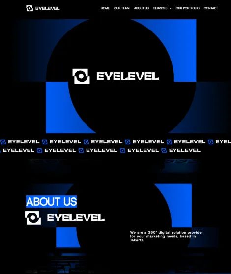
A digital marketing agency in Jakarta. The challenge: build credibility without looking like every other vendor. I translated their design guidelines into a WordPress site that positions them as a strategic Google Partner rather than a service list.
View site ↗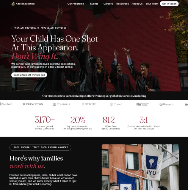
An education consultancy whose old site buried its main message under feature lists and generic clichés, leaving parents unsure what made them different. I rebuilt it in the language parents actually use — premium in feel, proving credibility with concrete numbers before doubt sets in.
View site ↗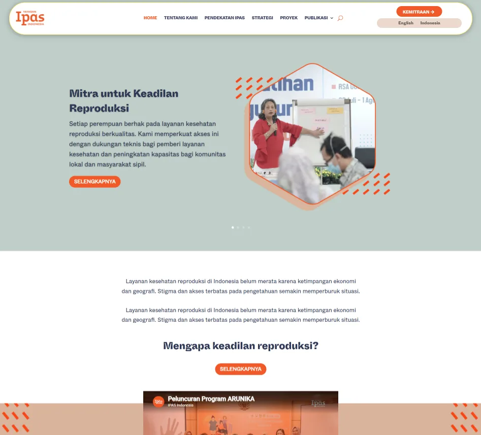
A reproductive health NGO expanding access to safe post-abortion care. Their old site had drifted away from the new international design system. I rebuilt it to align with the global brand without sacrificing what the Indonesian audience responds to.
View site ↗See the full portfolio — with the reasoning behind each decision.
Fewer than you think. Most company profiles work with five to seven: home, about, services, proof of work, contact. Extra pages usually come from habit rather than need. If you cannot state a page's purpose in one sentence, it probably should not exist.
It depends on who maintains it. Wix is easier for non-technical people and sufficient for most company profiles. WordPress is more flexible and more ready to grow, but wants a little more attention. I build both, so I have no stake in pushing you either way. The decision happens in discovery.
That is the most common situation and not a problem — as long as we know upfront. I set the structure and message direction; you or your writer fill in the copy. What ruins timelines is starting design while hoping the content will catch up.