A single page with one job: getting the right person to take one clear action.
Landing pages fail because they are asked to do too much.
A landing page that does not work almost always has the same symptom: a "Sign Up" button at the top, and also a menu to nine other pages, a link to the blog, social icons, and a newsletter form at the bottom. Every one of those is an exit from the decision you actually want.
A landing page is not a short website. It is closer to an argument: why this person, today, should do this thing. Everything that does not strengthen the argument weakens it.
So the first conversation is not about design. It is about one sentence: who lands here, from where, and what is the single thing they should do? If the answer has more than one item, a landing page is not what you need.
A session to lock one goal, one audience, one action. Often the part that changes the result most.
Message order from promise to proof to objection to ask — agreed before design.
One page, fast and light. Load speed is part of conversion, not a bonus.
Most ad traffic arrives on a phone. It gets designed there first.
Events wired from the start, so you know whether it works instead of guessing.
The right column matters as much as the left. I would rather lose the project here than have us both discover it in week five.
1–2 weeks if the offer and content are clear. Sharpening the offer is what usually adds time.
One audience, one goal, one action. If this cannot be locked, there is no point continuing.
Message order agreed as an outline before design — far cheaper to argue about at this stage.
One page, fast, mobile-first, with tracking in place.
Shipped with conversion events that actually fire, so the next decision has data behind it.
Typically below the company profile package. Depends on page length and integration needs.

A car rental service with drivers operating across cities. The challenge: a fleet spanning family Avanzas to VVIP Alphards had to read clearly in one screen without making anyone feel they were in the wrong place. I built a dark-and-gold hierarchy that leads with capacity and price, then cut the booking path down to a single step into WhatsApp.
View site ↗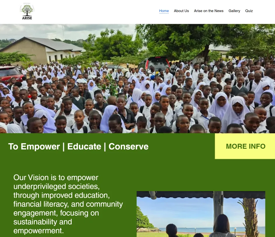
A youth-driven initiative in Tanzania. The challenge: a gamified quiz for students. I told their impact story through specific outcomes — 1,300 lunches a day, 100 laptops — turning a sense of connection into donor action.
View site ↗See the full portfolio — with the reasoning behind each decision.
A normal page lives inside navigation and invites exploration. A landing page deliberately removes every exit so only one decision makes sense. Technically both are pages; in purpose they are opposites.
Yes, usually as a subdirectory or subdomain. If your site already has authority, keeping it on the same domain is generally better than a separate one.
No. Google Ads and Meta Ads are not my service. I build the destination and make sure measurement is correct; ad management belongs with someone who does it daily.